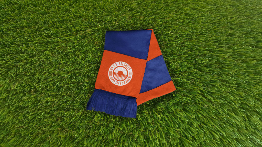

G.S. SALCHETO
Football team re-branding
2018
Gruppo Sportivo Salcheto is an amateur football team that gathers lots of funny individuals who cannot play football at high levels anymore. Lots of my friends are playing with this jersey and when they asked me to refresh their original logo I accepted with no doubts. Upgrading the old one was not so challenging, but the new one received much appreciation from the whole community.
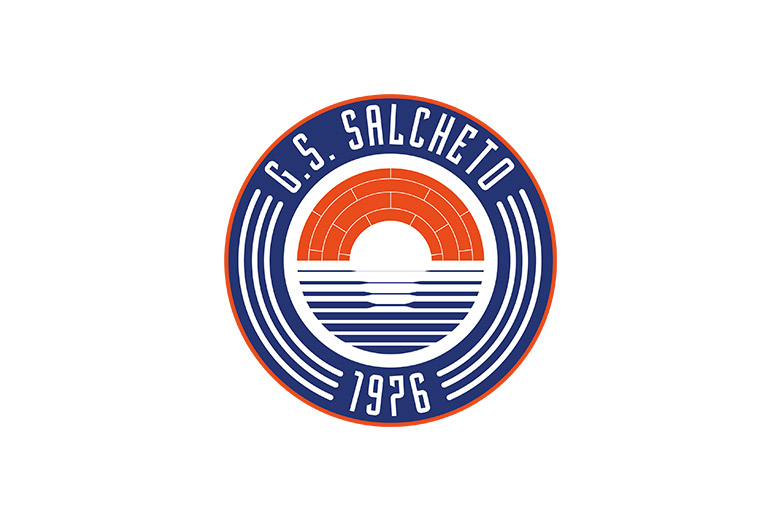
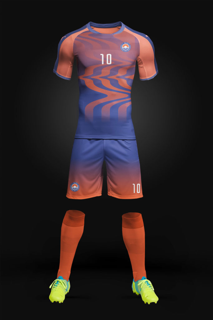
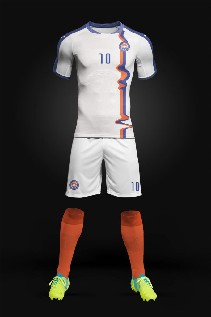
The main objectives were to give a contemporary touch while maintaining the old identity. Salcheto is a really small village with two honorable things: a bridge and a river. They had to be in the logo. So the icon changed from a shield to a more compact and developable circle. Then I used the official colors which are blue and orange, in 2 hues that could fit well, since the risk of pairing those 2 tints was to have something kitsch.